
10 Essentials for High-Converting Web Design for Coaches
If you’re a coach growing your business online, your website is often the very first place someone experiences your world. It’s where they start to feel your coaching style, your personality, and the transformation you can help them create.
A great site can draw someone in instantly, but if the design or messaging feels off, they’ll click away just as fast. And it happens all the time: stunning coaching websites that look beautiful but don’t actually convert.
Pretty is wonderful, but pretty alone won’t bring in paying clients.
Your site should show exactly who you help, what your coaching programs look like, and what someone should do next. Kajabi makes this so much easier by keeping your website, offers, email marketing, automations, and blog all in one intuitive platform.
In fact, I love it so much that you can use my special referral link to get 30 days of Kajabi for FREE! 👀
If your website hasn’t been consistently bringing in clients, a few thoughtful updates can make a big difference. Let’s walk through the essentials I recommend and take a look at real Kajabi examples so you can see these principles in action.
Why Coaches Need High-Converting Website Design
A coaching website is so much more than a digital business card. It’s where future clients begin forming a relationship with you.
When someone lands on your homepage, they’re already looking for support. They’re trying to figure out if you get them, if you’ve helped people like them before, and whether your coaching style feels right. Your site should give them clarity and confidence, not confusion.
That’s why effective coach website design needs to feel clean, welcoming, and aligned. Visitors should instantly feel like they’re in the right place. They should recognize their own goals in your messaging and sense the transformation you can help them create.
Tools and Platforms for Coaching Website Designs
Kajabi remains my top recommendation for coaches because it truly is an all-in-one platform. You get a full website builder, landing pages, coaching product templates, email sequences, payments, automations, a blog, and mobile optimization all in one place.
You don’t need plugins or extra software. You don’t need to hire someone to connect tools in the background. When everything lives under one roof, it becomes so much easier to focus on your actual coaching business.
When your systems flow, your visitor experience flows too.
Common Mistakes Coaches Make on Their Websites
The most common issues I see coaches make are:
- Unclear messaging
- Cluttered layout
- Too many menu items
- Missing social proof
- Not giving people a way to take the next step
Sometimes the design doesn’t quite match the coach’s energy. Sometimes the pages feel too text-heavy or too vague.
These are all easy things to fix. When you clean up even one or two of them, your coaching website becomes more welcoming, more aligned, and more effective.
10 Essentials for High-Converting Web Design for Coaches
A coaching website doesn’t need to be complicated to convert. It just needs to be intentional. When the right elements come together, your site becomes a space that feels welcoming, aligned, and easy to navigate.
These essentials are the pieces I see that make the biggest difference for coaches who want a website that feels like them and guides visitors toward becoming paying clients. Before you dive into updates or redesigns, here are the 10 core features that create a high-converting coaching website.
1. A Clear, Instantly Understandable Hero Section
Your hero section is your first impression moment. People don’t “read” it. They scan it. A clear headline that says exactly who you help and the transformation you support makes an enormous difference.
A strong hero section also benefits from a professional photo because coaching is personal. People want to see who they’ll be working with. When your hero section feels focused and grounded, visitors understand your coaching business right away.
2. Simple, User-Friendly Navigation
Your navigation should feel effortless. When there are too many menu options, visitors get overwhelmed and leave. When the menu is too sparse, they get confused.
A simple, intuitive structure helps people understand your coaching website and guides them naturally toward learning more about your coaching services. Kajabi keeps it simple, so your visitors always know where they are and where to go next.
3. Clear Calls to Action Throughout Your Website
Once someone recognizes themselves in your coaching services, they need a clear, simple path forward. A strong call to action doesn’t have to feel pushy. It’s just an invitation. Book a call. Learn more. Download a guide.
When these prompts appear at the right moments, visitors feel gently supported instead of overwhelmed. Kajabi makes this seamless by allowing your CTAs to lead directly to booking pages, offers, or automated follow-up sequences.
4. Social Proof That Creates Trust Quickly
Coaching is built on trust, and social proof can reinforce it. Thoughtful testimonials, screenshots, or client stories can instantly boost confidence. Be sure to provide examples of real people who have moved through your process and achieved results. This is a powerful way to shift someone from curious to ready to take the next step.
5. A Coaching Services Page That Feels Clear and Supportive
Your services page is where visitors start to understand what working with you actually looks like. Keep it simple, warm, and easy to follow so they can picture themselves moving through your process. Kajabi helps by linking your programs, checkout pages, and booking options in a smooth, seamless way.
6. Messaging That Actually Speaks to Your Ideal Audience
The fastest way to attract aligned coaching clients is through messaging that speaks directly to them. When coaches try to speak to everyone, the message loses power.
Specificity is what converts. Whether you’re a life coach helping people navigate transitions, a business coach supporting entrepreneurs, or a mindset coach helping clients build confidence, the language on your website should sound like you’re speaking directly to the person reading it.
When people feel understood, they stay longer.
7. A Personal About Page That Builds Human Connection
Your About page is one of the most visited pages on any coaching website, and it’s where people decide whether they trust you.
This is the place to be personal and warm. Share your story, your values, and the experiences that shaped your coaching philosophy. You don’t have to overshare, but you do want to help people understand the human behind the work. A grounded, authentic About page builds connection faster than almost anything else.
8. Helpful Content That Demonstrates Your Expertise
You don’t need to publish weekly to make an impact, but having a few thoughtful pieces of content helps visitors understand your coaching style. It shows them how you think, how you teach, and the kind of support you offer.
Helpful content also supports SEO, which makes it easier for people to find your coaching website in the first place. Kajabi’s blog makes this simple, and even one or two posts can help your website feel more robust and trustworthy.
9. A Mobile-Friendly Design That Works Everywhere
Most people will first look at your site on their phone, often while they’re in the middle of something else.
It helps to check your own site the same way. Just give it a quick scroll and notice how it feels. Is it easy to read? Do the buttons make sense? Kajabi handles most mobile formatting for you, but a simple spot-check can catch anything that seems off.
10. SEO Basics on Kajabi That Help Clients Find You
At its core, SEO is simply a way to make your website easier for people to understand. Kajabi handles most of the heavy lifting behind the scenes, so your role is to keep things clear and consistent.
Give each page a straightforward title, a meta description, and image descriptions that tell people what they’re looking at. Write the way you naturally talk about your coaching work. Thoughtful blog posts and resources can also go a long way in helping the right clients find you.
Examples of High-Converting Coach Website Designs
Here are a few real Kajabi sites from my portfolio that show how these essentials work in practice, with each one designed to reflect the coach’s personality, niche, and client journey.
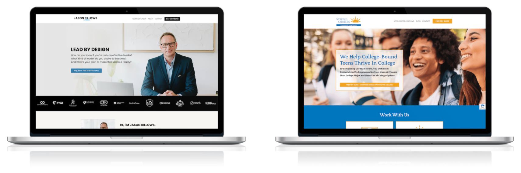
Jason Billows offers leadership and performance coaching, and his site leads with clarity and confidence. Visitors immediately understand who he supports and what he’s known for, and the clean layout makes it easy to move through his offers and take the next step.
Strong Choices supports families of college-bound teens, and the design needed to feel warm, structured, and reassuring. The site uses simple pathways, clear messaging, and supportive language that speaks directly to both parents and students as they navigate big decisions together.
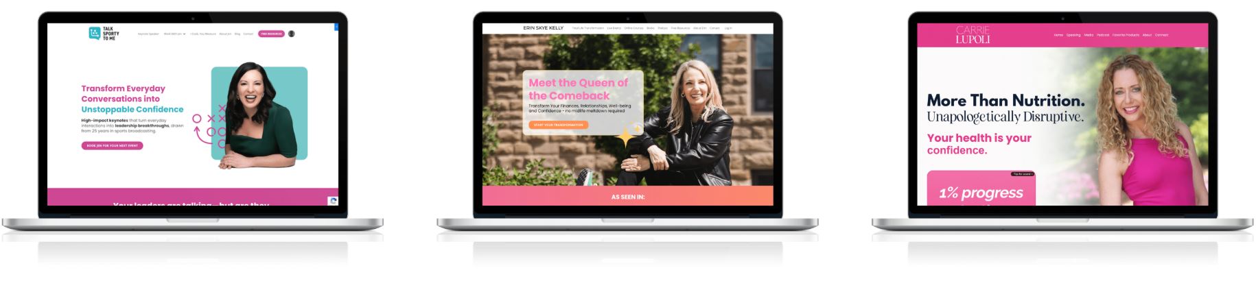
Talk Sporty to Me blends personality with professionalism. The visual branding is energetic and memorable, and the site guides visitors naturally toward her communication programs without losing the fun, approachable tone that defines her work.
Erin Skye Kelly supports ambitious women who want a full life reset. Her Kajabi site uses bold branding and simple navigation to showcase her events, courses, books, and podcast while giving visitors an easy way to step into her transformation work.
Carrie Lupoli is a nutritionist and behavior specialist who helps women break free from diet culture and fuel their bodies with confidence. Her Kajabi site reflects her bold, empowering message and makes it easy for visitors to explore her coaching, podcast, and resources in a clear, supportive way.
Together, these examples show how thoughtful design, clear messaging, and a strong sense of personality can turn a coaching website into an aligned, high-converting client experience.
👉 See more Kajabi website examples that will blow your mind.
FAQs
Should I Hire a Professional for Web Design for Coaches?
If you want a polished and strategic Kajabi website without spending months on DIY design, hiring a Kajabi Expert can save you time and help you launch confidently. I help coaches refine their messaging, create aligned visuals, and build websites that support long-term business growth.
What Pages Should a Coaching Website Include?
Most coaching websites only need a homepage, an About page, a Work With Me page, a Blog or Resources page if you create content, and a Contact or Book a Call page. Simple always works best.
For smaller coaching websites, my Launch Lab is perfect to get you a site up and running without the need to hire multiple people.
Should I List My Coaching Prices on My Website?
Both approaches can work.
Sharing your prices upfront makes it easy for potential clients to self-select, which can save time on both sides. Leaving them off your site can open the door to a deeper conversation before numbers come up. Choose the approach that feels most aligned with your coaching style and the way you like to welcome new clients.
Do I Need a Blog to Make My Coaching Website Convert Better?
Not necessarily, but having a few helpful posts can build trust and help people understand your coaching approach. Kajabi makes this easy to manage, so you can create content at your own pace.
The Bottom Line
A high-converting coaching website is intentional, aligned, and focused on clarity.
When your messaging and visuals feel aligned, your website starts working with you, not against you, and that shift alone can change how your coaching business grows. Kajabi gives you everything you need to build a coaching website that looks beautiful and works beautifully behind the scenes.
If you'd like help designing your Kajabi coaching website or want a custom design that reflects your brand, you can book a design discovery call.